My Role
UX and UI
User Research
Persona Development
Wireframing
Prototyping
Information Architecture
Team
Solo Project
Timeline
4 weeks
American Express Company is a global payment and travel company. The Company's principal products and services are charge and credit payment card products and travel-related services offered to consumers and businesses around the world.
Challenge
Millennials spend their money frivolously, but the spending that might be mocked as frivolous – like greater spending on streaming services and electronics such as iPhones – may be more indicative of the times we live in than they are a sign of thoughtless overspending.
Outcome
A credit card that enables millenials to have a stressfre and more transparent relationship with money.
Impact
Seamless integration of just a few features helped users be more informed about their expenditure, and efficiently complete simple tasks like searching a charge by a vendor.
DISCOVERY
Research &
Planning
Working with Amex app started – when my friend cried to me about how difficult is for her to keep a tab of all transactions, as she’s a shopaholic, and a digital shopper. That had my mind churning and thinking how many more millennials like her, would just feel exactly the same.
To actually validate that this was a really problem I started conducted secondary research. With secondary research it was super clear as to how financially unsound our younger generation could be.
Market Research
The millennial generation's attitudes toward money and investing differ from previous generations, particularly when compared to the baby boomers. Millennials worry they will not be able to meet key financial goals, such as buying a house, paying off student loan debt, or saving for retirement. Millennials are more likely to emphasize an investment philosophy that enriches both themselves and the world around them.
01 41% of millennials admit spending more on coffee than on their retirement plans.
02 55% of millennials have bought something promoted on social media.
03 Millennials spend $300 a month on alcohol.
04 57% of millennials don’t have an emergency fund.
05 72% hired an expert for their financial plan.
06 Over 86% of millennials are digital buyers.
07 47% of millennials shop on Amazon once per week.
08 Free delivery would convince almost half of millennials to make a purchase.
09 47.9% of millennials are homeowners.
Design
Challenge
That validation directed my research into a simple HMW statement -
How might we enable millennials to be financially empowered?
The Solution
The Users
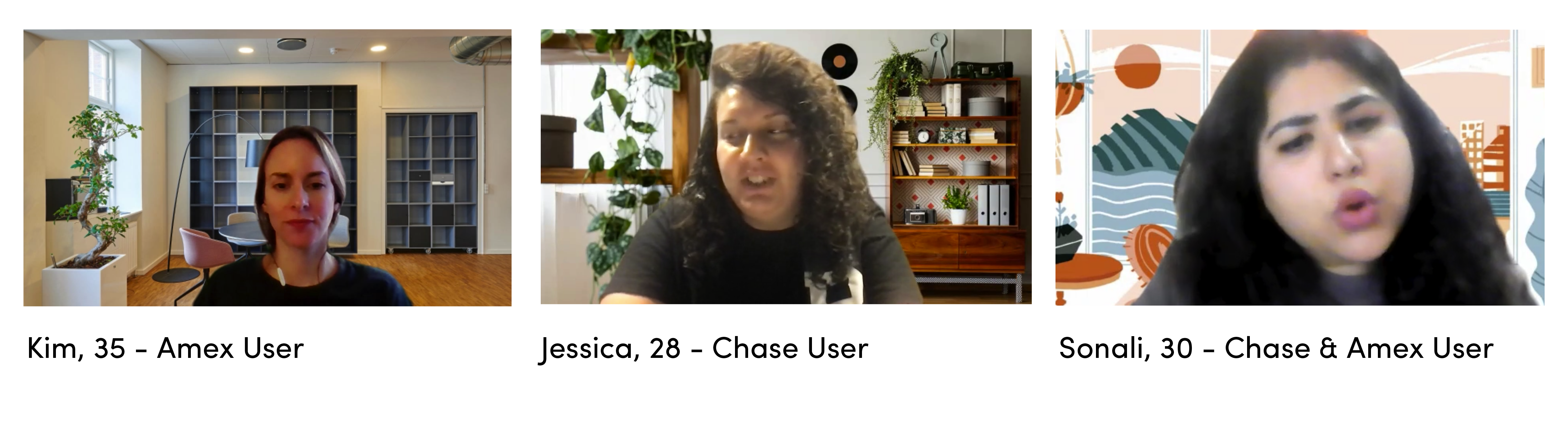
I recruited participants and started conducted reviews, to dive deeper into the problems. I conducted interviews with both Amex and non-Amex users. Amex users helped me understand what problems they face while using the app, where as other users helped me understand what all their banks did, that Amex did not.
Insights
01 Mindful about transactions - 6/6 participants keep a regular check at their bank accounts to keep a check of all the transactions.
02 Convenience - 6/6 All participants say they feel happy about the user interface and experience that their banking apps offer.
03 Bad with managing finances - Most younger millennials said that they are bad with handing money.
04 Savings - 4/6 participants say they save to make bigger purchases in future.
Needs
01 I need access to my banking app in order to keep a
check at the financial transactions.
02 I need intuitive banking app so that I can easily
manage my accounts.
03 I am a spendthrift, thus I need to better manage my finances.
04 I need to create a balance between my earnings and my savings.
Insights helped me flesh out the needs, and those needs led me to ‘HMW’ statement here. This started defining what are most pressing pain points that I am trying to solve via this case study. These HMW statements will further help brainstorm the solutions/features that can be added to the app, to make millennials have a better financial relationship.
Key Insights
1. Mindful about Transactions -
All participants keep a regular check at their bank accounts to keep a check of all the transactions.
2. Convenience - All participants feel happy about the user interface and experience that their banking apps offer.
Key Needs
1. I need access to my banking app in order to keep a check at the financial transactions.
2. I need intuitive banking app so that I can easily manage my accounts.
HMW
1. HMW make it easy for users to keep a check of all transactions?
2. HMW have users gain 360degree view of their financial health?
DEFINE
Ideating the Solutions
The insights gained through users helped me further the process into how do we start bringing in the features that will fulfill the need. To do this, I conducted brainstorming with 8 people, and used those insights to priortize the features I want to develop.
One of the most exciting parts of the project was how I conducted a group brainstorm session with 8 participants. I facilitated the session, and to gain maximum insights out of this session - I had participants do the Crazy Eights exercise. 8 minutes, 8 ideas! All the participants shared some really thoughtful solutions, that helped me further develop my product roadmap.
Common Business
& User Goals
With my research in the business, I found common Business and User Goals to not provide with any features that might overstep the business goals -
Easy access to important information
Need for really good customer experience
Empowering individuals and small business owners
Features Identified
Product roadmap was laid out in order to understand which of these features are at utmost priority. How much effort would go into building these, and how much value it would provide the users.
The four features that came out through the product map, that Amex wasn’t offering its users are -
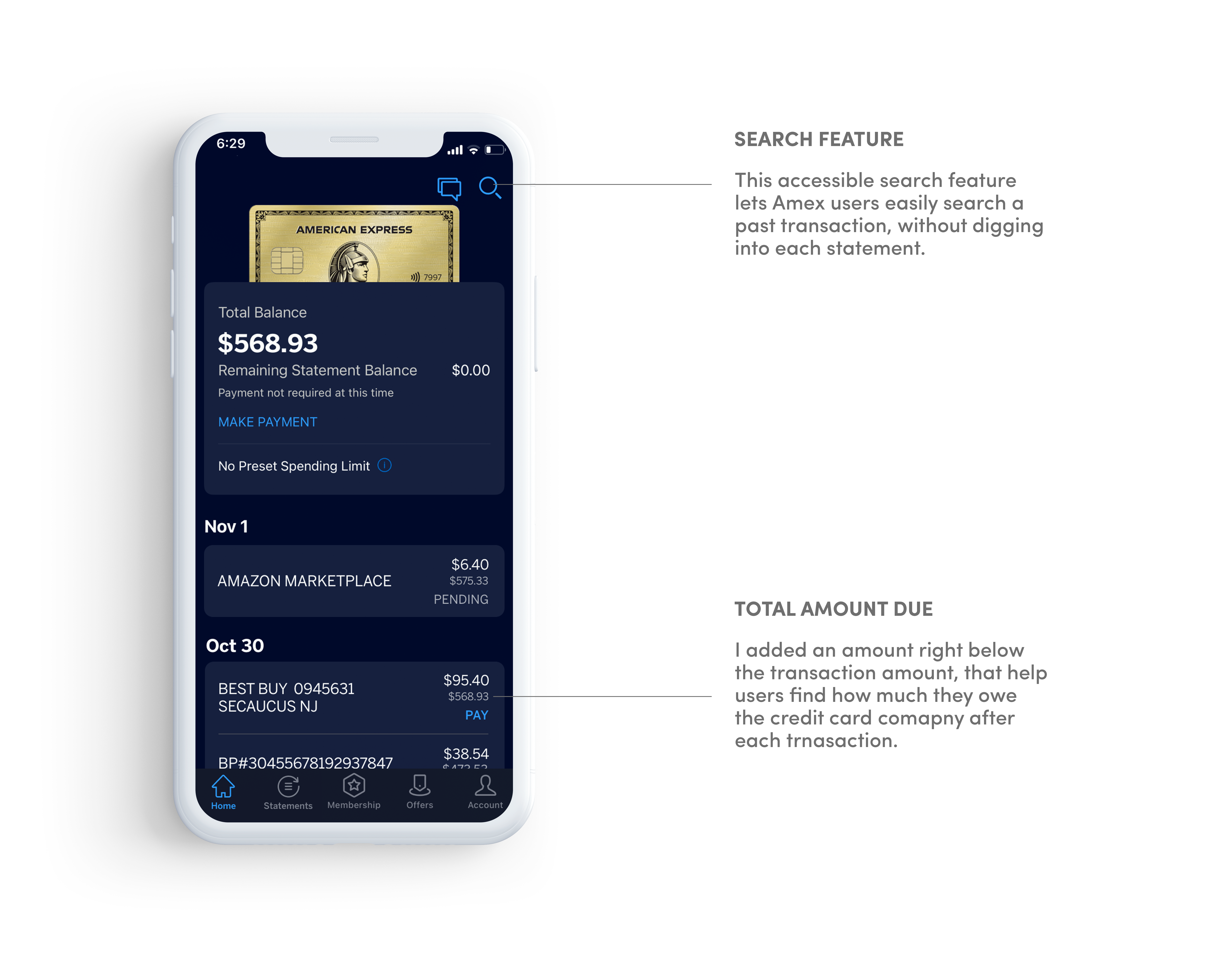
1. Total amount due to the credit card after each transaction.
2. Adding filtering options while searching - like by vendor
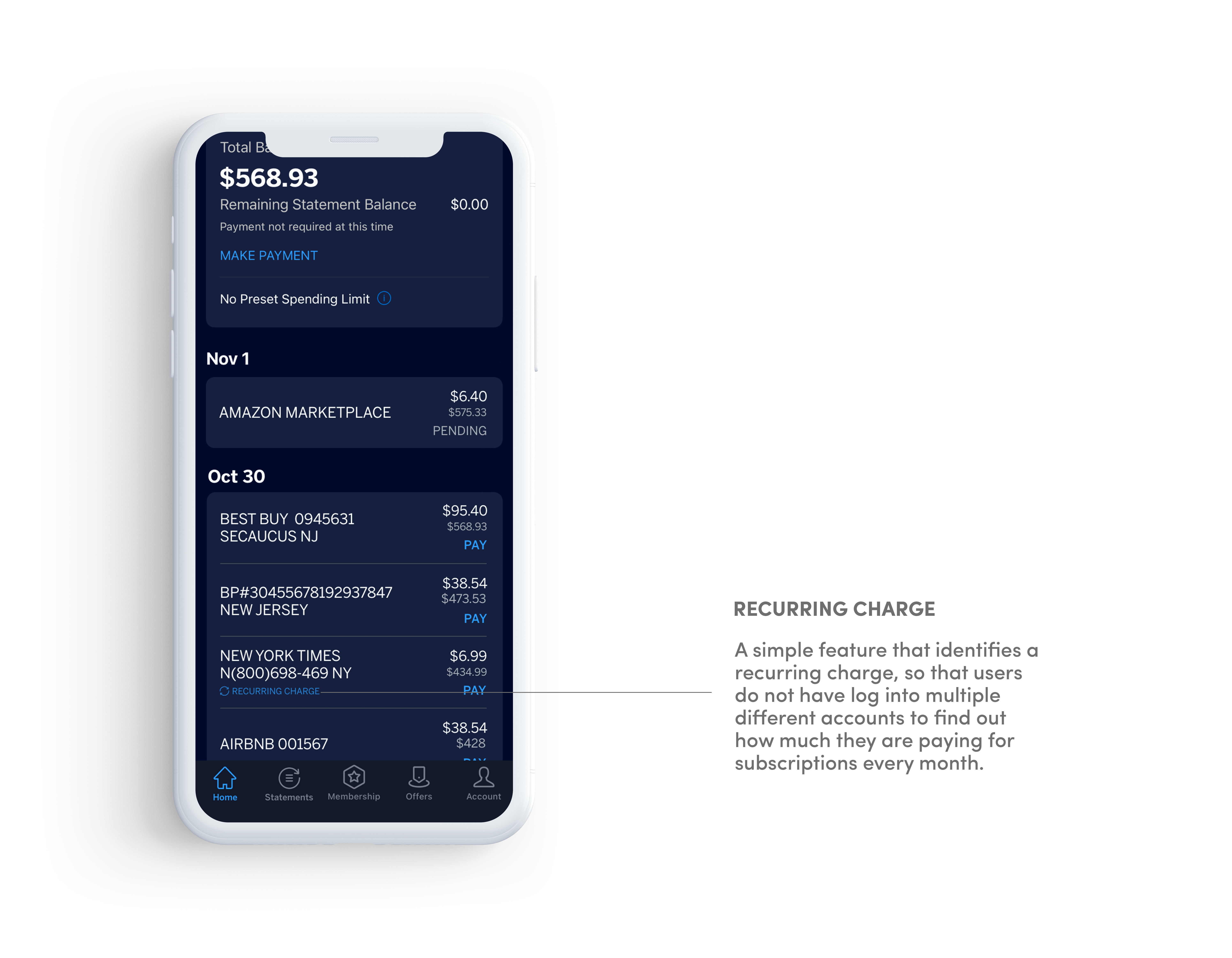
3. Color coding or tagging a recurring charge
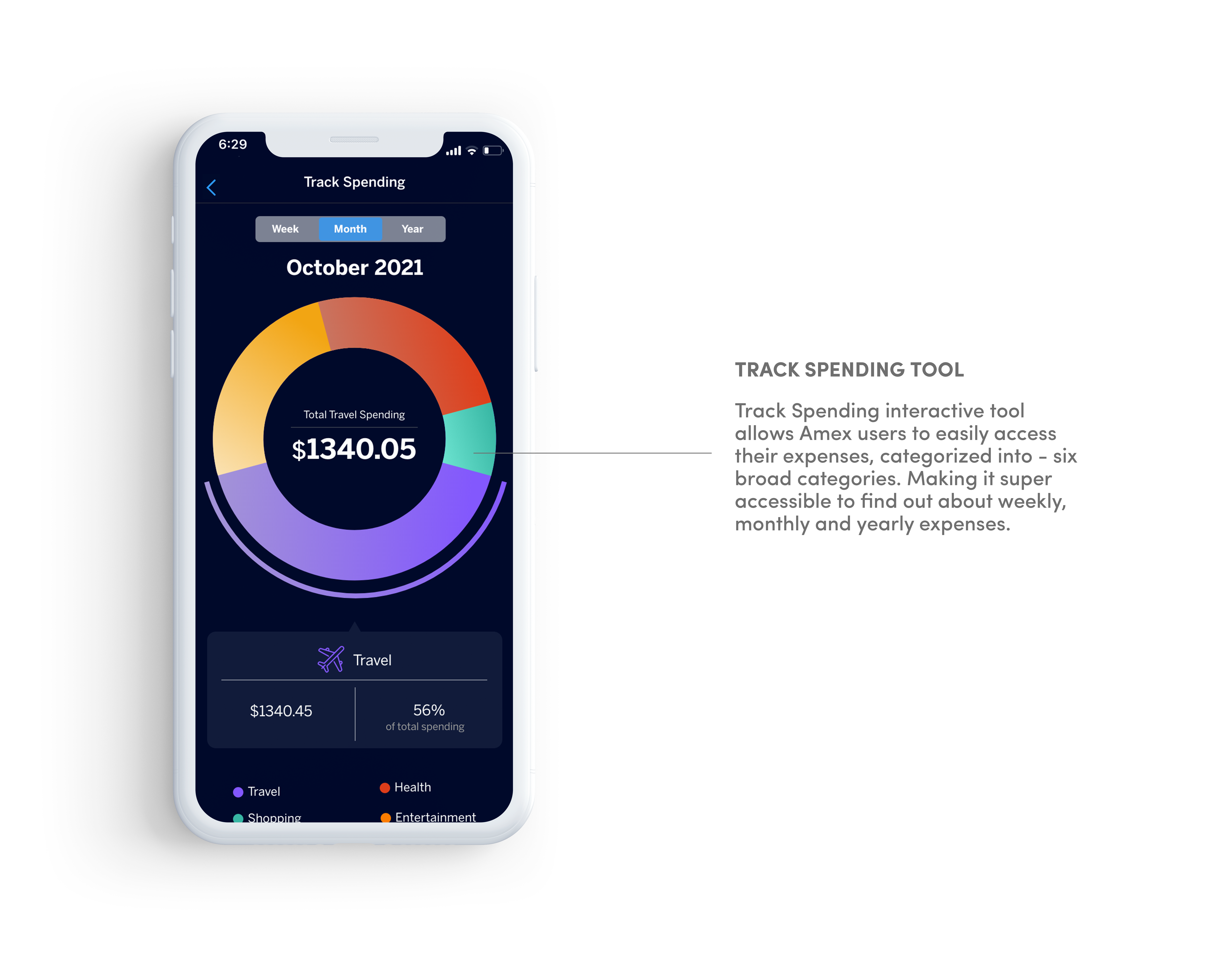
4. Visualizing Monthly/Weekly Spending (Bird’s eye view)
Understanding Constraints
One of the biggest constraints in this project were to seamlessly integrate the features. I had to follow the existing design system, and design patterns that Amex already uses in the app. To stick to the typographic and the color system, I laid out the UI kit. Even for the track spending tool, the colors and the pie chart were inspired by what Amex provides in the desktop app.
Iterating
UX Solutions
Once I had an understanding of what features I am executing, and how the design system function, I started iterating hi-fidelity wireframes. Rapid iteration, and gaining feedback in the very early stages helped me fix some issues in the early prototypes itself.

Task 1
Find the total amount due after October 22 purchase
Total amount due - I got 60% task completion rate. For people aware with the mental model, they did not even have to think twice. Other people were trying to understand the concept, but the math did not add up in the early prototype.
Task 2
Identify a recurring charge in the current transactions
I got a 100% task completion rate after I made the change to how recurring charge was identified. It was also reflected to be really helpful feature.
Task 3
Find how much Jen spent on travel in October
The first prototype had the track spending tool under the statements tab. People did not expect it to be under statements, I was given feedback that they would likely have it closer to the transactions on home page.
100% task completion rate - Everyone told accurately where the track spending option were, and where to find particular merchants to find the highest transaction.
Task 4
Find a charge by Airbnb in July
Search feature on the home page itself was again reflected as a very helpful feature. Search filters worked perfectly, as expected and learnt from existing design patterns. The design system was also adopted from the existing Amex design system.
Takeaways
1. Working with Constraints - As a creator of things from scratch, sometimes we are more excited to do a lot of new things, where as this project helped me learn how to work with constraints. Learning how to focus on the features that would bring more impact, and least disruption with in the app.
2. Testing is the Key - Testing was a real key and determinator of the impact. Some things that were obvious to me, were clearly not obvious to the users, and testing helped me develop features that function properly.
Reflections
Pay it feature - I would like to further continue my search for 'Pay it' feature. Reach out to Amex Product designers in order know more about the business goals behind it. As during testing, I got a constant question as to why ‘Pay it’ is even so prominent a feature on the home screen itself.
Business Goals - I was under constant battle during this project, as at any point I did not want to over step the business goals. On my end I tried best to understand the business goals, and providing users features that would eventually also help business in the long run.
Next Steps
1. I would like to further conduct testing, and see hope the icons,
and search features are fully functioning.
2. I would like to develop some more screens, that during the limited
4 weeks period were not fully fleshed out.
3. If given a chance to work with Amex on this, I’d learn more and
further use Zeplin to hand these over to an engineer.